

chromatic void
A BUTCHER'S #66 free
A BUTCHER’S hook/look (Cockney rhyming slang)
following issue #62 coloring - a look at the absence of color
Greek to me
blue, no blue. I'd come across this before, but on doing a bit more reading - I find it even more incredible. In his writings, Homer doesn’t mention the color blue - not once, not even when describing the sky or the sea, referring to them as light or dark. And it's not just in Ancient Greece - the word for blue doesn’t show up in any Hindu, Chinese, Arabic or Hebrew texts, even though colors were seen and written about - they just never called anything blue. Things get stranger…..
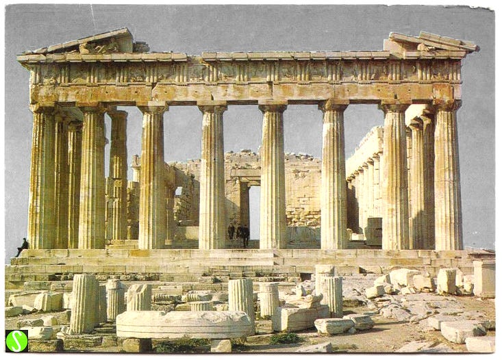
Homer does refer to the sky as ‘bronze’ but not to say that the sky is bronze colored, but more like a polished shield, shiny and bright - talk about a different way to see the world. In the same way, he implies that wine and the sea were red - referring to a tone, rather than a color. Aristotle named seven distinct hues that he thought originated from black and white, but they weren’t actually colors, just tonal variations in brightness.
Meanwhile, even more mystifying - neighboring Egyptians created a blue dye as well as blue pigment for their makeup - so they had a word (or rather symbol) for blue in their language. So it seems that… if you don’t make it, it isn’t anything.
‘why is the sky blue’? - the most common question from a kid. Here’s something really strange that came out with a study* - if a child is never told that the sky is blue (even when told the colors of other things, including blue things) - he/she will not be able to say what color the sky is - it just isn’t anything, no known color. Now there’s a Greek thinker!
* by Jules Davidoff, a professor at Goldsmith’s college used his very young daughter as a subject (no harm done!)
here, not there
I titled this series minus space and the paintings really got people agitated! The central absence is just that, absent - it’s not painted, just exposed white gesso.
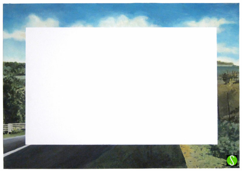
When looking at a painting, a viewer’s eyes naturally start in the center, but as there’s nothing present or depicted here, one’s eyes are drawn to the border where the partial image is of a road that leads you back in…to nothing.
Some looked at these paintings as hopeful and positive, others found them unnerving and disconcerting. My work is done - isn’t ambiguity great?
a red bird is red but blue birds are not blue
Come again? no really, it’s an optical illusion……. mondo bizzarro! A red bird is colored with a pigment, often a consequence of stuff it has eaten (flamingo - shrimp - pink). However when we see a bird that appears blue, the color we see is not due to a pigment but to the physical structure of the feathers themselves. If you grind up a ‘blue’ feather from one of these parrots, the dust would be gray.
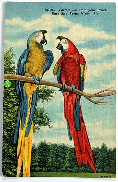
structural coloration: ‘The blue color is a structural color created by the way light scatters off the microscopic air pockets and keratin structures within the feather's barbs’. This phenomenon is called Rayleigh scattering - it’s the same process that makes the sky appear blue.
fade to light gray
color reduction - it’s pretty surprising to read that Frank Lloyd Wright’s original proposal for the color of The Guggenheim was to be red. While appearing more like pink in his drawing, the intent was in his 1944 proposal to Hilla Rebay, art adviser to Solomon R. Guggenheim was ’Exterior: red-marble and long-slim pottery red bricks - red is the color of creation.’
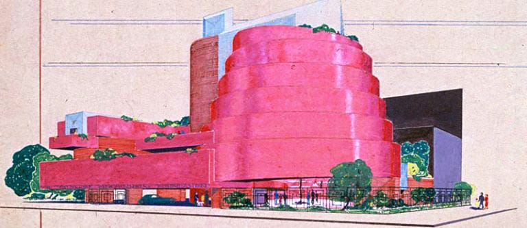
Red wasn’t really what they had in mind, suggesting yellow or green marble instead. Wright answered back that it be black. That didn’t fly either. By 1952, he had proposed an exterior of concrete and marble gravel with a ‘look similar to alabaster’. Trouble was, they ran out of money and the marble was cut out and in the end the building was painted a shade of buff, described by the NY Times as a ‘tepid statement’. So before opening it was repainted a very soft yellow cream, described as ‘sort of evaporated-milk ocher’ or ‘jaundiced’. i.e. not very nice.
Since then, the color has been getting lighter, losing its beige-ness and becoming its now near-white light gray. But it is grey and not white.
classic reproduction
Before seeing images in realistic color as the expected norm, it’s odd now to imagine that it wasn’t like that not too long ago - photographs, images of artwork in books and postcards were all in black and white. Serious Art books had color plates printed separately in color, which were inserted into the book.
I've always liked black and white postcards of artwork - they have their own distinct appeal. Once the only option for reference or souvenirs, they tell a different story than the color versions we're now used to - revealing details and information that color sometimes overshadows.
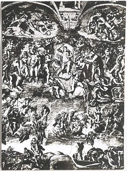
I really wanted to find a b&w postcard of a Monet painting (impressions in b&w, very conceptual!) but this works, especially as the prominent color in the original is the blue of the background sky.
______________________________________________________________________
I’ll get into Ancient Roman painted marble statuary at a later date, even though it would fit here….

The colour that cannot be named ... Totally brain busting stuff. 🤯
Rayleigh? I thought he scattered his cloak across a pool of mud not to spatter the hem of QE's dress which caused chatter up the ladder. Glad that ABUTCHER 66 hues to the line. The white rectangle might stand in for a flat earth or the One called everywhere or a space opened for new thought, a stage contained by border staging areas for set changes. No void reminds Carpaccio scene 3 Venetian characters painted as Christ with a saint beside him on either side in a gorgeous landscape The Meditation on the Passion = not nothing nowhere ambiguity opens mind ty